Build.com
I was a full-time visual designer at Build.com, a billion dollar online retailer for home improvement goods. As part of the design team I was responsible for homepage web design, email design, mentoring new hires, online catalog, teaching the team about After Effects, as well as being the lead illustrator and animator.
Below is an animation project for the release of the build.com shopping app. I worked with the media director to create the script and concept for the animation. I worked with my friend Glenn, a design team member for what should be included in the kitchen set design. I created the animation with Adobe Illustrator and After Effects. It was a very fun and rewarding project from the first concept drawing, storyboards, all the way to the final animation.


Below is a series of concept art sketches and elements from when I was exploring which style to eventually run with.


I was responsible for designing the homepage each week. We would run themed sales and I would work with brand managers to coordinate the right images and products to showcase. I would also design the page to aesthetically go with the theme by using elements down the page. I would also hard code the carousel graphics each time to go with the theme. We would work as a team to come up with sales themes and graphics. This particular theme I had come up with the graphic style.


I created many icon sets throughout my time at Build.com. Below is an example of one set used to help the customer user experience in choosing the perfect fan. The product search page featured here are the bath fans section.
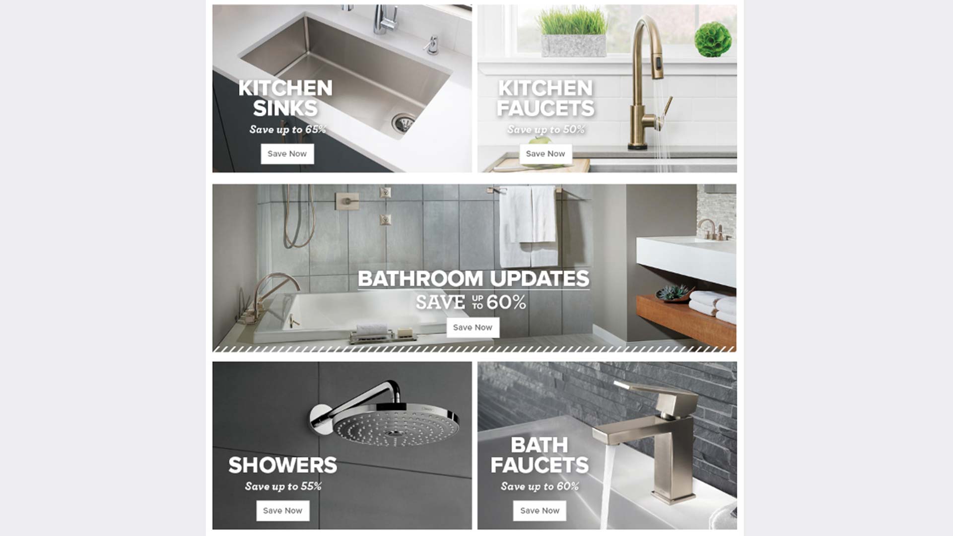
Email design was a big part of marketing at Build.com and I created tons of email designs and templates throughout my time there. We worked with each brand manager to choose specific brands and styles of products to feature as well as implementing the sales theme into emails. Most emails were promo driven but we also created content based emails. Drip campaigns emails for pro as well as general consumers were also important for us to create. I helped code templates of emails when we switched over to a mobile first approach. I also trained and mentored two successful hires to become awesome email designers.

Below is an intro I created in Adobe Animate that was used across channels from TV commercials to email gifs.